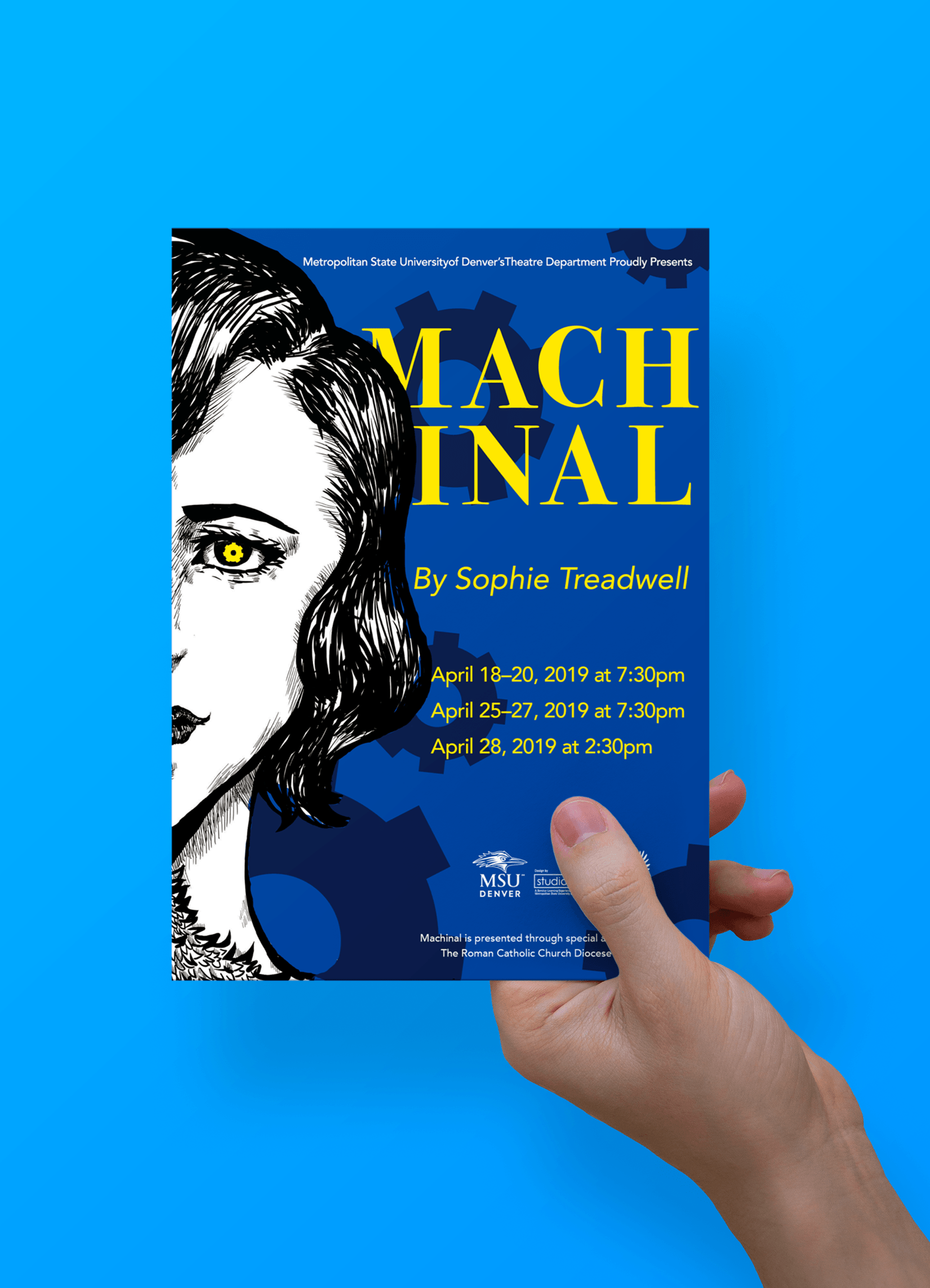
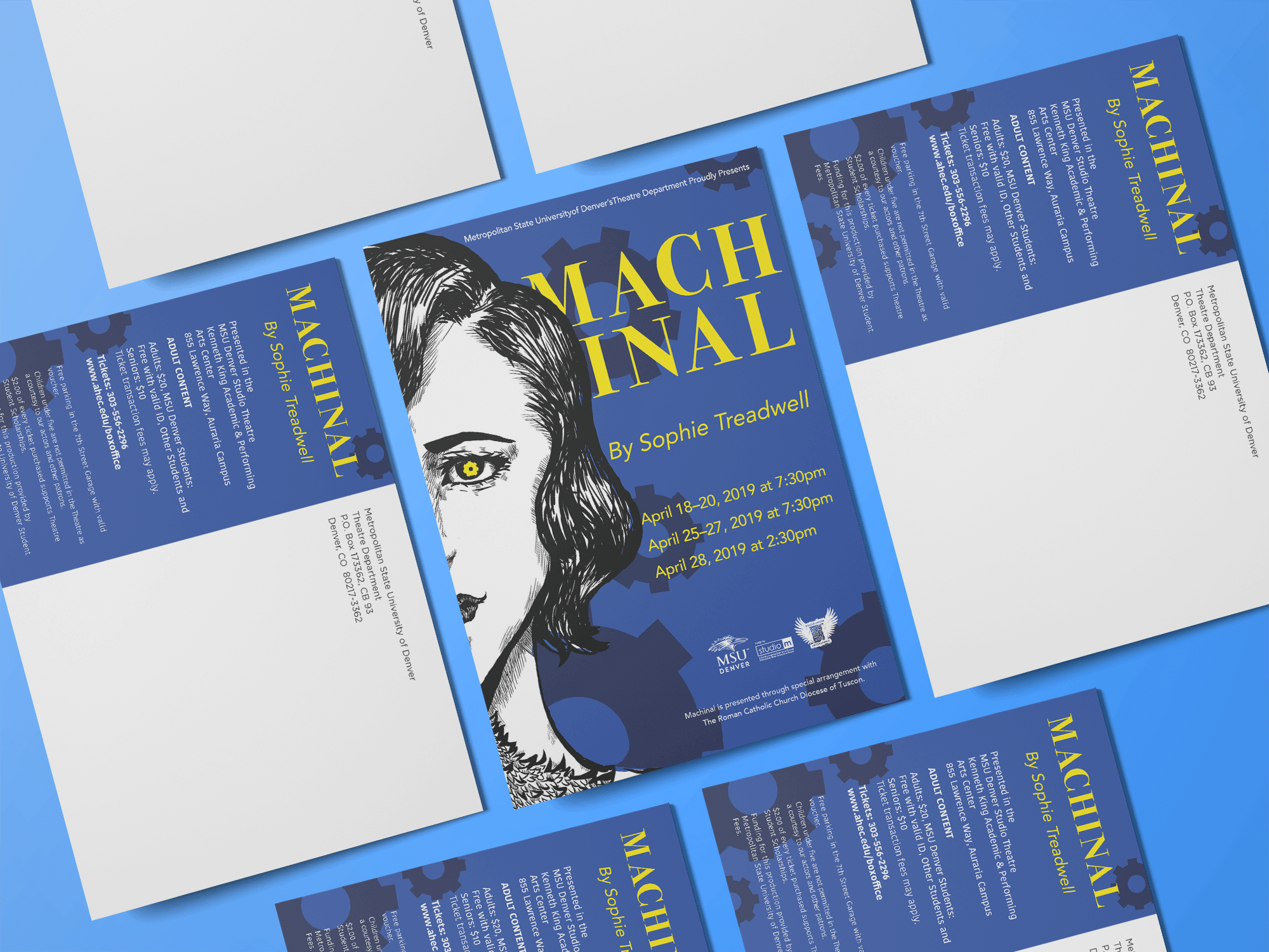
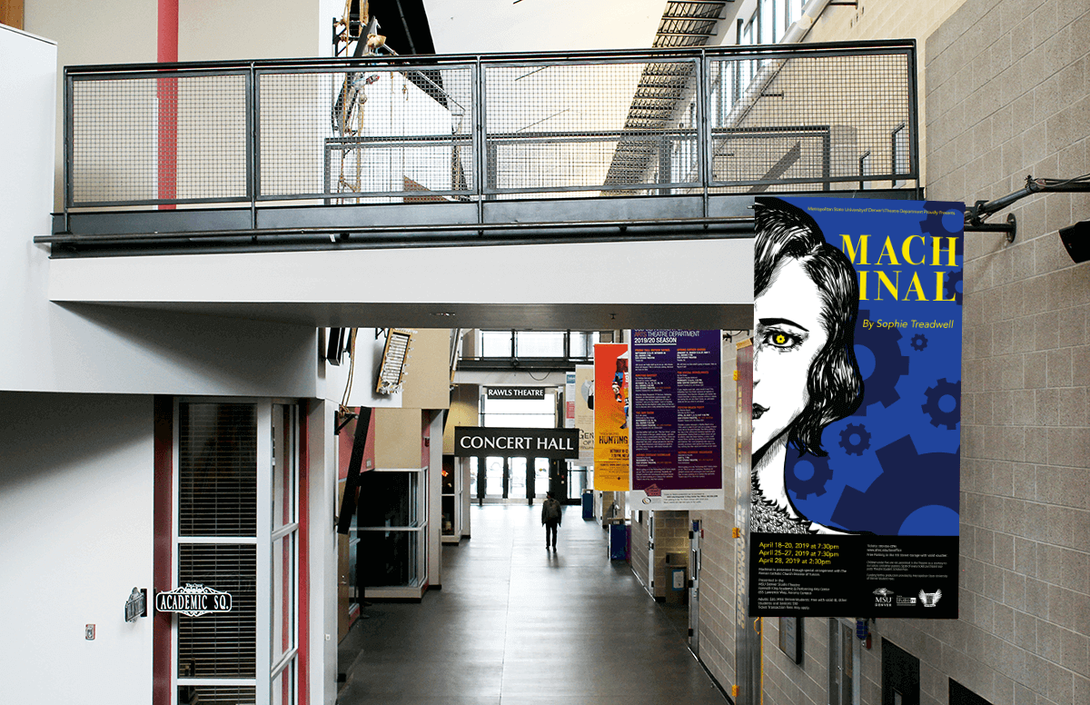
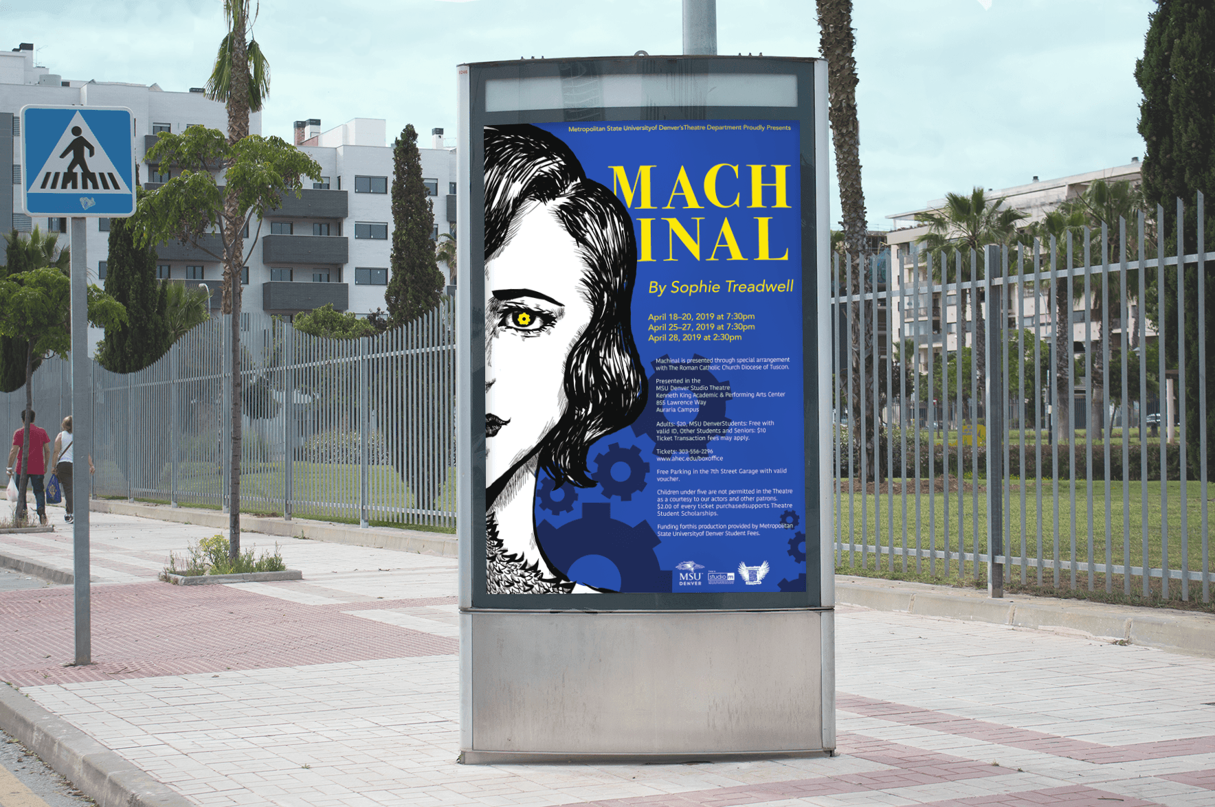
Machinal is a play hosted by the MSU Denver Theatre Department. The project needed to design of a series of promotional materials, including a poster, postcard, fliers, exterior banner, and more.The client was very specific in their requests wanting Helen, the main character to pop-out more and for the play itself to appear more triumphant than a tragedy.
Approach:
After reading most of the story and the play reviews, the idea of hand-drawing Helen as a calm, rebellious, and capable woman came to my mind. This is because the hand-drawing will be used to give the audience background information tied to the story. Dark blue is used to represent the industrial era. By combining this and Helen’s experience, the bright yellow gear is used metaphorically to reflect a different female perspective when looking at society as a whole. The dark gears represent the history of the time along with the color itself representing Helen’s perspective of the world. The typeface sits behind Helen in order to make the flyer more eye-catching along with allowing the font to better represent the style of the 1920’s.
Design Strategies
Research & Insights
Campaign Strategy
Guideline Study
Messaging Development