Overview:
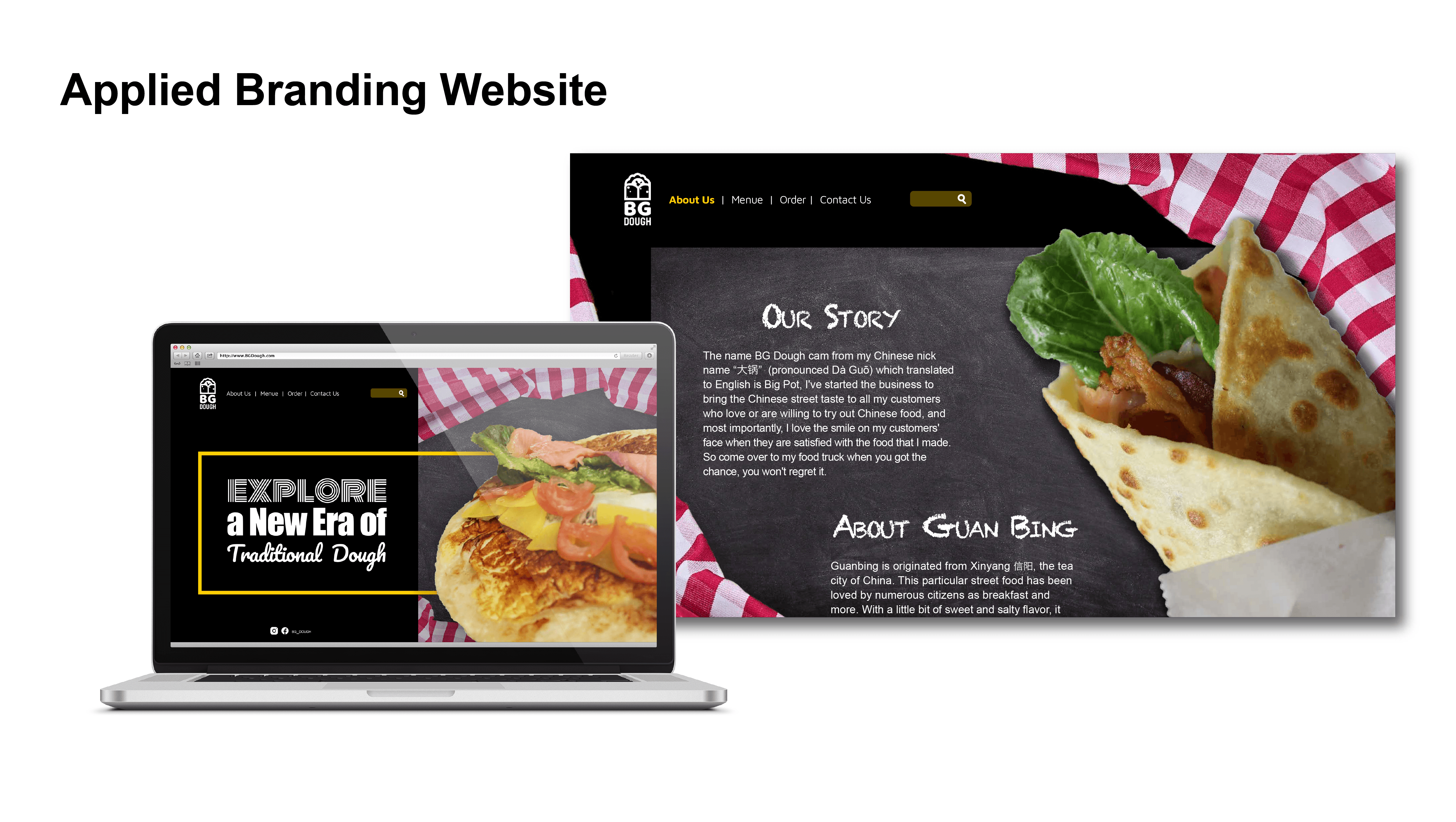
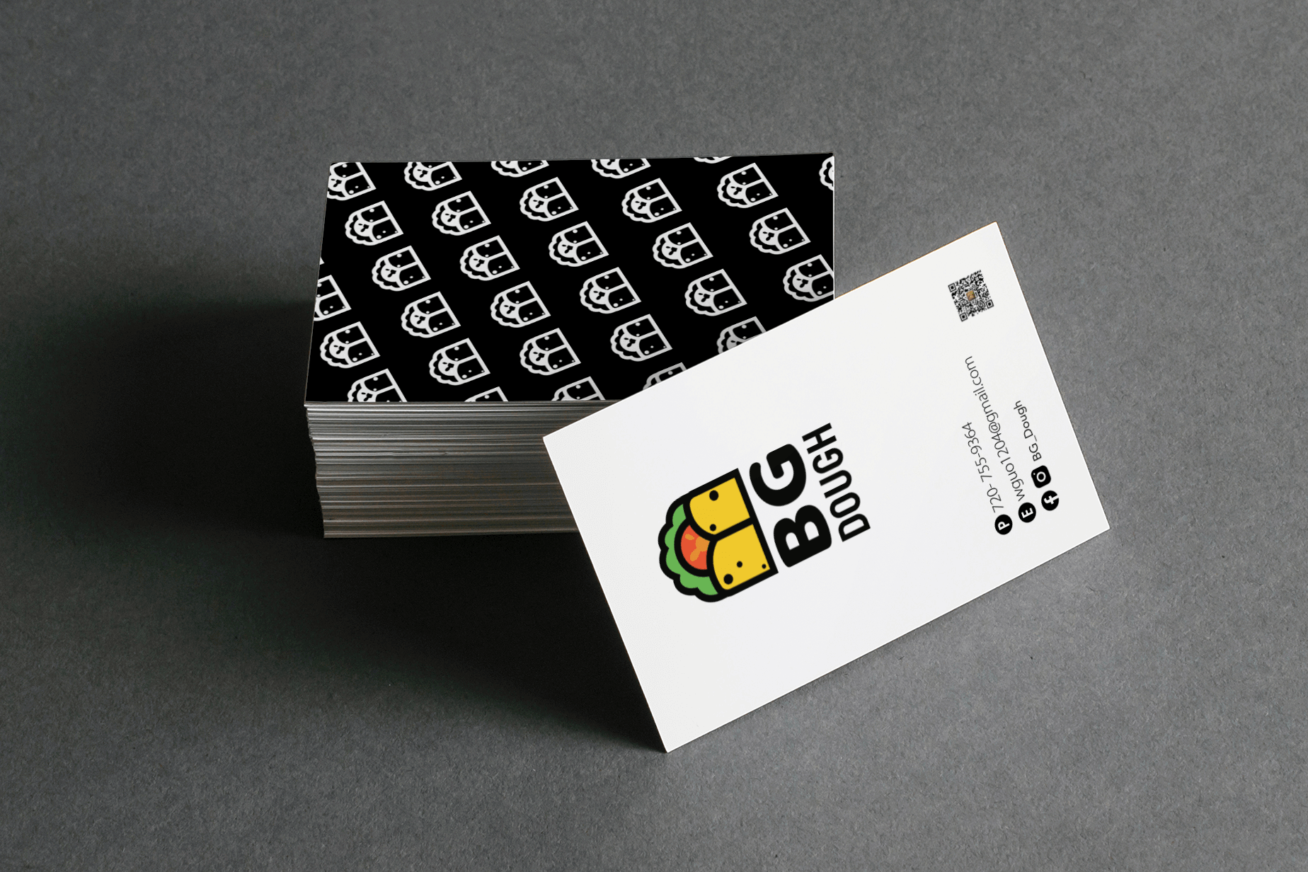
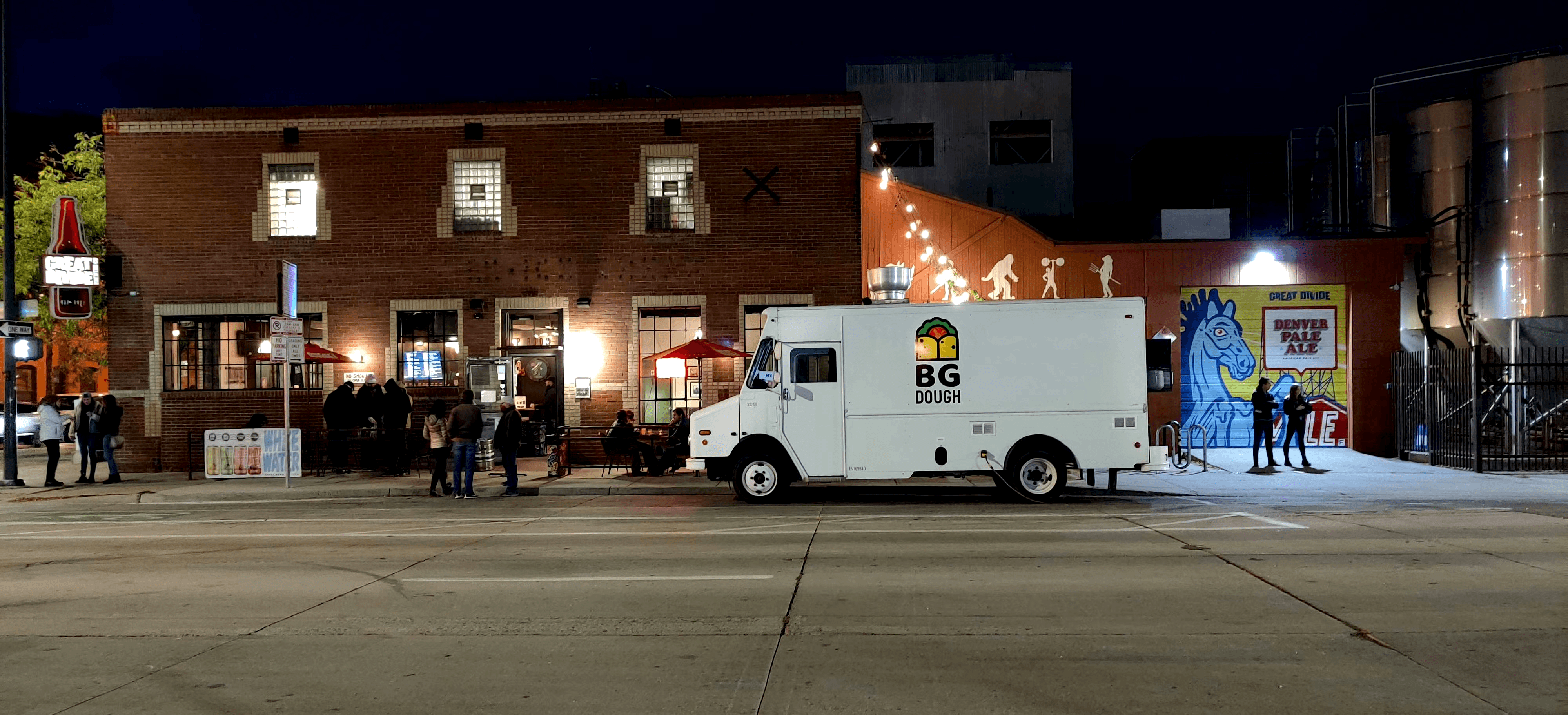
The project commissioned is a Chinese fast food branding design. The owner of this business is a young, Chinese man, who wants to carry traditional Chinese home-cooked meals to each guest’s table in the U.S. The business is different from most local Chinese restaurants, as it is a fast-paced catering business where the magic comes from a small food truck. What this project requires is a basic brand/system design, and a series of accessories that are driven by the most important factors such as Logo design. This includes a food menu (and poster), a business card, T-shirts, and interface mock up related design.
Approach:
Because the owner wanted to expand on the local fast-food industry, and because most of the business will carried out via food truck, my idea was conceived from the “dough” found in the brand’s name. In the early stages of creation, I tried the main dishes on the menu. Due to the special production technique, and the unique shape, I thought it would be a great idea to simplify the appearance of the food.
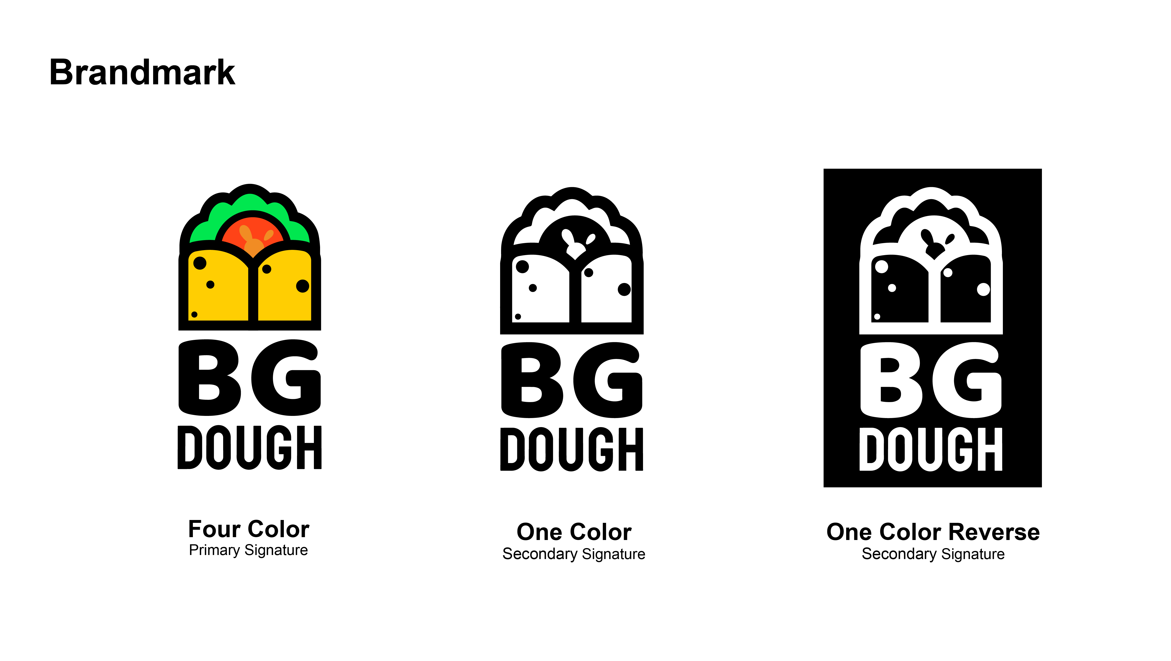
Clean, easy-to-understand, and concise are the design features that employers want. However, since the employer is in the early stage of starting a business, the budget available is limited. Therefore, after combining the requirements of bilingual printing, and doing individual printing searches, I decided to use a white background with a full-color logo, and necessary social media accounts as the final solution.
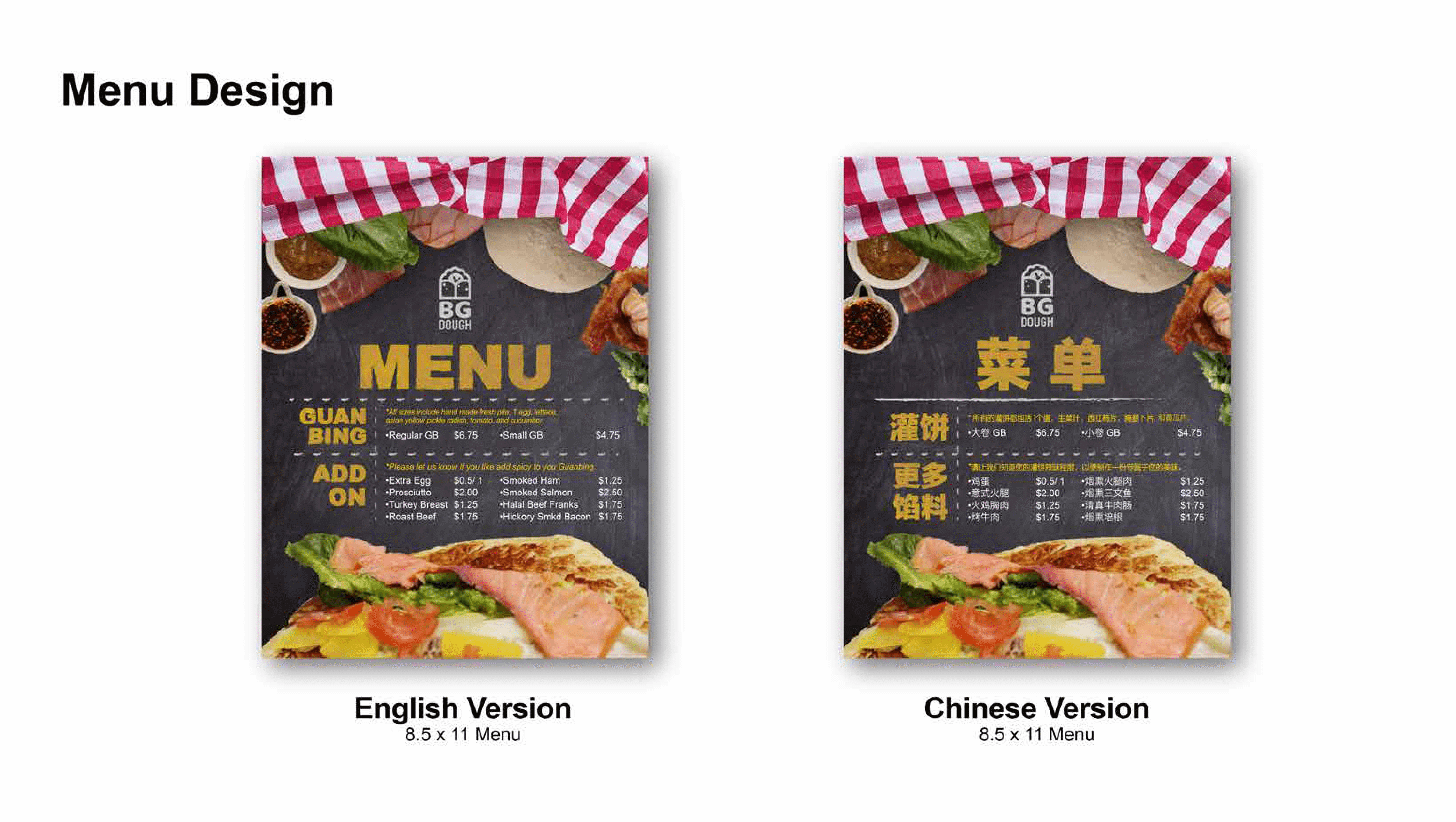
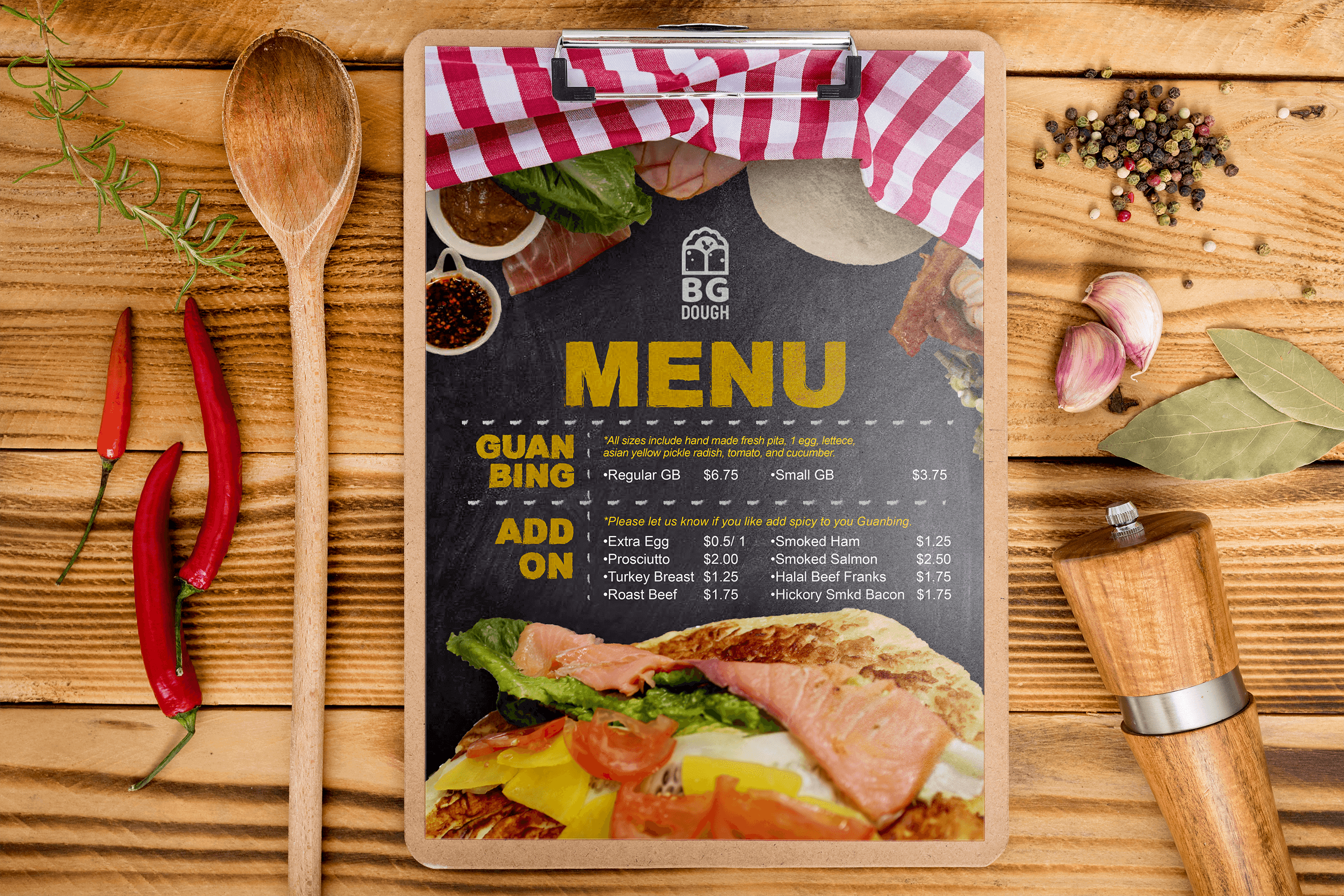
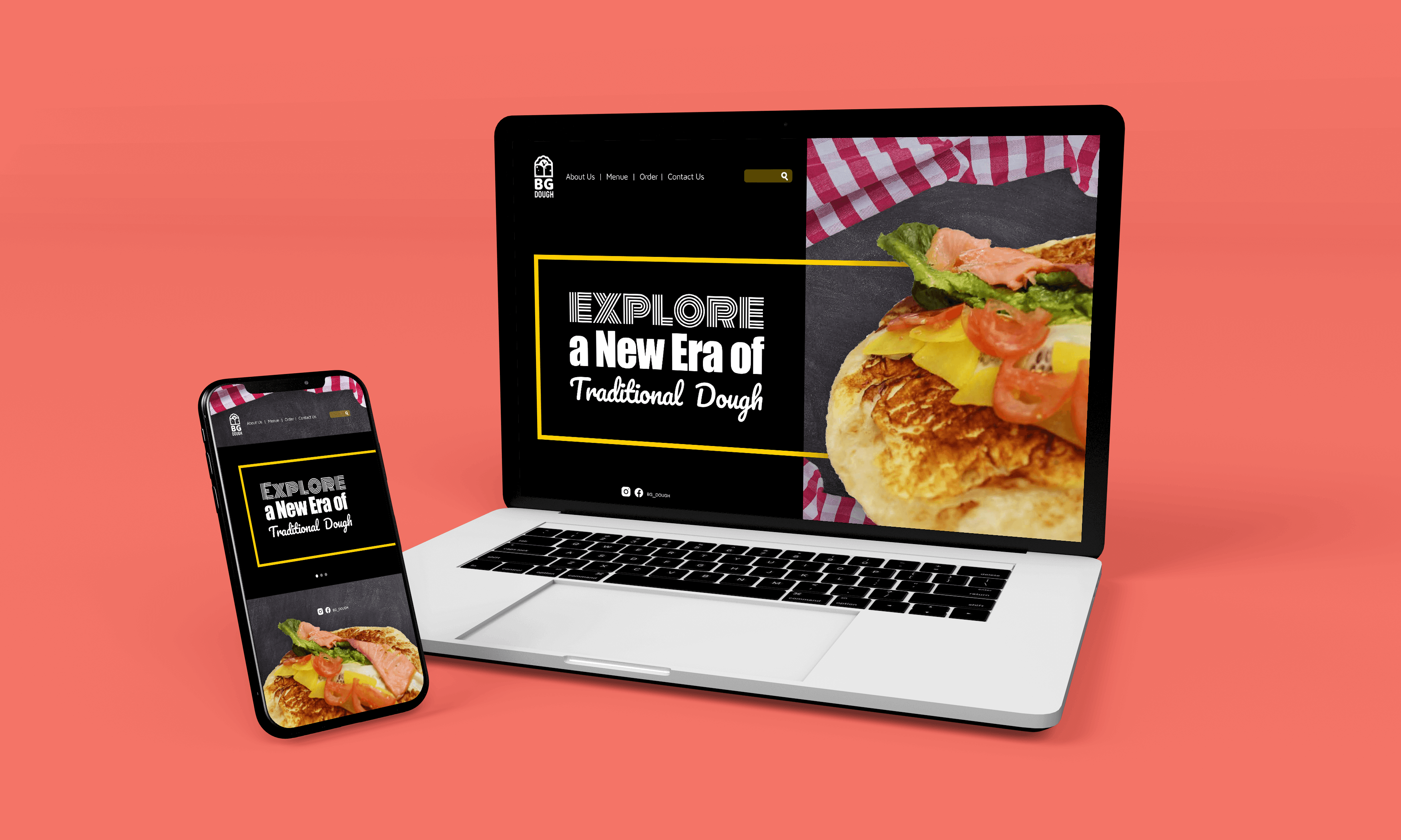
When creating the menus, due to the requirements to produce bilingual (Chinese and English) versions, my point of view was to retain its unique concept of traditional Chinese food and combine it with the idea of fast food. This means that it will not be as luxurious as a “sit-down restaurant”, but it can reflect the combination of both “speed” and “food”. The choice of making the fonts bilingual with relative space and ease of reading, reflect the advantages found in the locations where the food truck would be booked for business. Those locations are mostly within the cities of Denver, Centennial, and Boulder (more specifically, the business is partnering with the bars and supermarkets found within these areas). These locations have an audience who mostly focus on time, efficiency, and are primarily busy with work. Since there are a countless number of competitors, garnering brand attention and highlighting the characteristics of the brand were my goals when creating the menu design.
For the reasons stated above, as well as the type of meals offered by the company, I adopted a rough, industrial style of blackboard and chalk to reflect the company’s food culture; clean, easy-to-understand, and concise. Blackboard and chalk have the potential to bring a different type of environment compared to the everyday workplace that the customers find themselves in. Also, chalk can easily modify the content as well as giving a clear and easy-to-read visual experience that better reflects the company’s culture.
BGDough is a local small food business, for more information please check the social media accounts: BGD Instagram
Asian Avenue magazine Interview | Vol15 Issue 11
Design Strategies
Language Translation
Messaging Development
Mock up Development
Campaign Strategy
Photography